You have taken the first step and decided to display your photo at Image City Photography Gallery. After you decide on your print, next you have to decide on how to present your image. If you plan to frame your photo yourself, it is important to learn how to install the picture frame wire. The following link provides clear instructions to ensure that your framed photo will hang well in the gallery.
After you have framed your photo, think about your purpose in displaying your work. If you are more interested in displaying your images as an expression of your photography/artistic vision, and your end goal is to provide viewers the opportunity to see and react to your vision, then perhaps pricing is not your priority. However, if your end goal is to sell your image, it is important to understand how to price your photos.
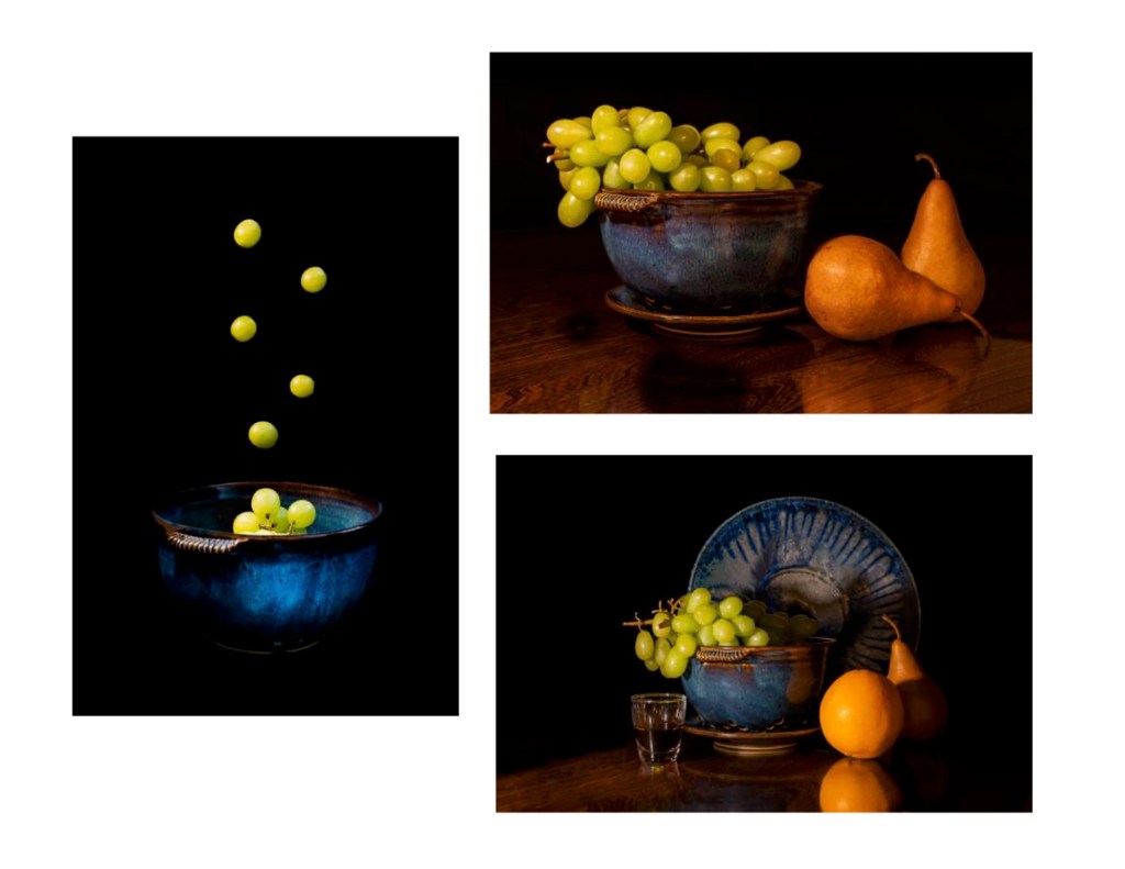
The second annual Red Show will be coming back to Image City during the month of February. Participating photographers select one photo that shows their own interpretation of the Red theme. We hope that you consider participating in this show!
Amaryllis by Luann Pero
What do we know about the color red? We know that it attracts attention and elicits strong emotions such as love or anger; it is the color of drama and passion. It is stimulating, vibrant and exciting. Red inspires desire. The Partners at Image City are excited about seeing your visions in red.
Recently when a guest was visiting the Holiday Show at Image City Photography Gallery, we became immersed in a conversation about the titles of some of the displayed photos. She mentioned that after reading the title of Steve Levinson’s photo series, Dancing Flames, as she stared at the images, she could actually start to see dancers within the flames. After our discussion, I began to wonder just how important is a title for our photos?
As I thought about it, I realized that deciding on a title is often a challenging task for a photographer. How might you create a title that is appealing, intriguing and relates to the art itself?
Recently a visitor at Image City Photography Gallery and I had a conversation about the photos created by guest artists Michael Tomb and Marcia Zach. After viewing their images, the visitor came out of the Neuberger Gallery and said that the photos had “touched her heart and brought tears to her eyes.” We discussed how some photos seem to have a WOW factor.
When photographers consider the possibility of displaying their photos at Image City Photography Gallery or at other venues, a question that often is asked is “What makes an effective photo exhibit?” There are no hard fast rules, but the following are some guidelines that may help in selecting images for your exhibit.
A question often comes up regarding how much editing a photographer should do to a photo. Often when a photographer first discovers the power of Lightroom, Photoshop or multiple other editing software products, the result might end up in over-processed photos that look unnatural. It’s really an art to figure out when you have done enough editing, and when you have done too much. The instinct comes with practice, but there are some items to consider when you are editing your images. Of course, don’t take any of these as strict rules but rather some things to consider. What looks good in editing is mainly a matter of personal preference.
One indication that you have over-edited is when your adjustments start to distract from the photo you captured. This can happen with any number of modifications, but there are some that are particularly important to keep in mind.
DODGING AND BURNING (Lightening and Darkening)
When lightening and darkening parts of your image, consider that less is more. When brightening up the subject, if there is a large bright halo surrounding the subject, it might be viewed as a sloppy edit. Another example can be seen when bringing down the highlights too far, for example in a sunset scene, which might result in a dark ring around the bright sun. Additionally, when removing all the shadows from an image, if it starts to look flat, it might be getting over-edited.
OVER-SHARPENING AND CLARITY
When used well, the clarity slider can help to bring some edge contrast back to a photo. On the other hand, when used poorly, it could create terrible color, and cause halos around strong lines. According to Pro landscaper photographer, Mark Denney, “When I first got into photography, even if I had an image that was sharp, I would end up applying too much sharpness or too much clarity to where the image had a kind of gritty, rough, over-texturized quality to it, which just looks awful.”
OVER-SATURATED COLORS
Saturation describes the intensity of the color in your photo. Some photos are naturally more saturated than others, but how much you decide to add depends on your subject and your intention. If you are creating a surreal image, you might feel comfortable making large shifts in saturation. Some photographers enjoy over-saturating certain parts of an image to create a specific effect. Photographers interested in showing a more natural image, might consider using saturation with care. Sometimes an oversaturated photo looks unrealistic. It might leave skin tones looking orange, trees looking neon and oceans looking an unrealistic shade of blue. Mark Denney has done a great deal of research over the years trying to find a way to determine when a photographer has gone too far with saturation and he says that the only way he has discovered is “When you zoom all the way into a photo and look closely, if you have started to lose the details, you have oversaturated the color.” Sometimes it might be more effective to use the Vibrance slider rather than the Saturation slider. The Saturation slider increases all the colors in a photo; whereas the Vibrance slider adjusts the intensity of only the less saturated colors in a photo. Consider your intent of the photo. If you want to capture a foggy, misty Adirondack morning, you might find that low saturation adds a dreamy look to the image. In other cases, for example in a photo of a girl in a red dress, perhaps you want a fiery feel; in that case it might benefit to increase the saturation of the dress. Think about the story you are telling.
CONCLUSION
Small shifts in your editing can have big effects on your photos. Learn how to make changes in post-processing to get the look that you want and always keep in mind that you are the artist, and ultimately what your intent is should influence your editing decisions the most.
There are countless videos and resources out there to help you if you are interested in honing your editing skills. If you are interested in seeing Mark Denney describe his thoughts on over editing landscape photos, check out the brief video below.
YOUR TURN
How do you decide when you’ve done too much editing? Do you look for any signs while you are processing? Let us know your thoughts in the comments section below.
Now that you have chosen which photos you would like to exhibit, and if you have decided that you want to print on paper, the next question is how do you display your photo?
When you go to a framer to have your beautiful print framed, there are many possibilities to consider. The process of framing your print includes mounting, matting and framing. Some questions that your framer might ask you include: how do you want it mounted, what kind of mat do you want and what is your frame preference?
Let’s start with mounting. To protect your photograph from bending or wrinkling, and to prepare it for framing, your print needs a sturdy backing. Though there are several options, one of the most popular choices used by many photographers is foam board, which is a high quality, yet economical and efficient choice. Some framers will refer to this as foam core mount board.
Next your framer will most likely ask you if you want your print matted or not. Regardless of your final decision re: mat vs. no mat, both are valid options with endless possibilities. For smaller pieces, adding a mat behind the print can be a valuable asset. The spatial effect of the added mat gives the image breathing room by providing a clean border that allows the photo to stand out. Larger prints can be effective without a mat, but again, this is a personal choice.
If you have decided to include a mat, your next step is to choose the color of your mat. Of course this is entirely your decision, but often black and white mats are commonly used by photographers when exhibiting. These neutral colors provide a simple, professional finish for your photo. Often photographers who are hoping to sell their work choose black, white or variations of black and white because these colors are the easiest to match with décor and frame choices and make it easy for customers to imagine the photo in their own homes. Seek advice from your framer regarding the best shade of white or black that complements your photo.
Although there are many variations, most mat boards fall into three categories: regular, conservation and museum grade. Regular matboards are constructed of wood pulp that is treated with calcium carbonate to slow the harmful effects of acid and lignin. Untreated regular mat board could be a threat to art and photos, but it is no longer possible to buy mat board that is untreated This popular type of matboard is recommended for general matting and framing presentations. They are suitable for most everyday matting needs.
ConservationGrade matboards are acid-Free and Lignin-Free, creating a purified paper that is fade and bleed resistant and buffered with calcium carbonate to keep them safe for long term presentation of art. This type of mat is effective for art of personal value, photography, limited edition and fine art prints, and documents/diplomas.
Museum Grade mat boards are made of cotton which is naturally acid-free and lignin-free so it starts and stays pH neutral and safe for art. This type of mat, which is typically the most expensive, is suitable for valuable works of original art, historic documents, or artwork desiring museum grade presentation and preservation.
After you have decided on the color and type of mat to use, your next decision is which type of frame to use. While there are numerous choices of materials, wood or metal frames are the most common that many photographers use to showcase their prints when exhibiting in a gallery. While there is generally a good bit of latitude in terms of creative expression with framing options, framing for an exhibition can be a bit different from framing for your home. Ultimately, your frame choice is a personal decision, but keep in mind when exhibiting a photo, it makes sense to consider that the viewer should focus on your photograph more than anything else. Often exhibiting photographers avoid frames that might distract viewers from the photo.
Your final choice is to decide on the type of material you should use to protect and showcase your framed photo. After you have selected your frame and mat, then your framer asks you if you would like glass or acrylic, and if you want glass, which type? Glass, while fragile, is generally less susceptible to scratching, making it easier to clean. When it comes to price, acrylic can be more expensive than glass. The main disadvantage of using acrylic is that it has a higher likelihood of being scratched. Also, acrylic should only be cleaned with a microfiber cloth, using mild soap only in extreme cases. Anything beyond that could risk damaging it. Whether you choose glass or acrylic, you will also need to decide on the finish. Plain glass, which has a clear finish, is the most conventional and is ideal for most photos because it is like looking through a window. If your photo is colorful, it is a good option as it won’t soften any of the colors in your photo. Keep in mind that a clear finish is reflective; thus it could cause glare if placed near a window, where the sun shines through. If glare from sunshine is an issue, your next option is non-glare glass. Some photographers like this option if their photo doesn’t have bright colors or is entirely in black and white. One aspect about non-glare to consider is that it does reduce the sharpness a bit. Another option is anti-reflective glass. It has a coating similar to what is used on sunglasses. This type of glass virtually eliminates reflections, but it is an expensive glass.
Presenting and framing photographs is truly an art in itself. Before making your final decision about how you want to display your photo, visit Image City Photography Gallery to see how others have framed and matted their printed photos and see which ones you like best. If you have questions about anyone’s framing/matting techniques, just ask any of the Gallery Partners for assistance. Then when you go to your framer, you will have a general idea of the look you are seeking.
So, you have decided that you would like to submit some photos to the Magic of Light Exhibit at Image City. The first part of your process is to decide which of your photos you should submit. This is the most difficult part. Photographers enjoy submitting to this annual juried show either because they get great pleasure from having one of their photos on display or because they are hoping to win one of the three awards provided by Image City, Lumiere Photo, or Archival Methods. Regardless of your goal, think about choosing photos that seem to have a WOW factor that you believe will leave an impression.
Many times when a photographer decides to exhibit at Image City Photography Gallery, the first question that arises is “What should I use for printing my photo ?”
There are many possibilities of photo printing mediums from which to choose. The three most popular are paper prints, metal prints or canvas prints. Additionally some photographers use acrylic, glass or wood. For this article I will concentrate on paper, metal and canvas.